Create a custom report
Build a custom report in Featurebase with your own charts, metrics, filters, and breakdowns to answer questions the built-in templates don't.
Written By Markus Palm
Last updated 7 days ago
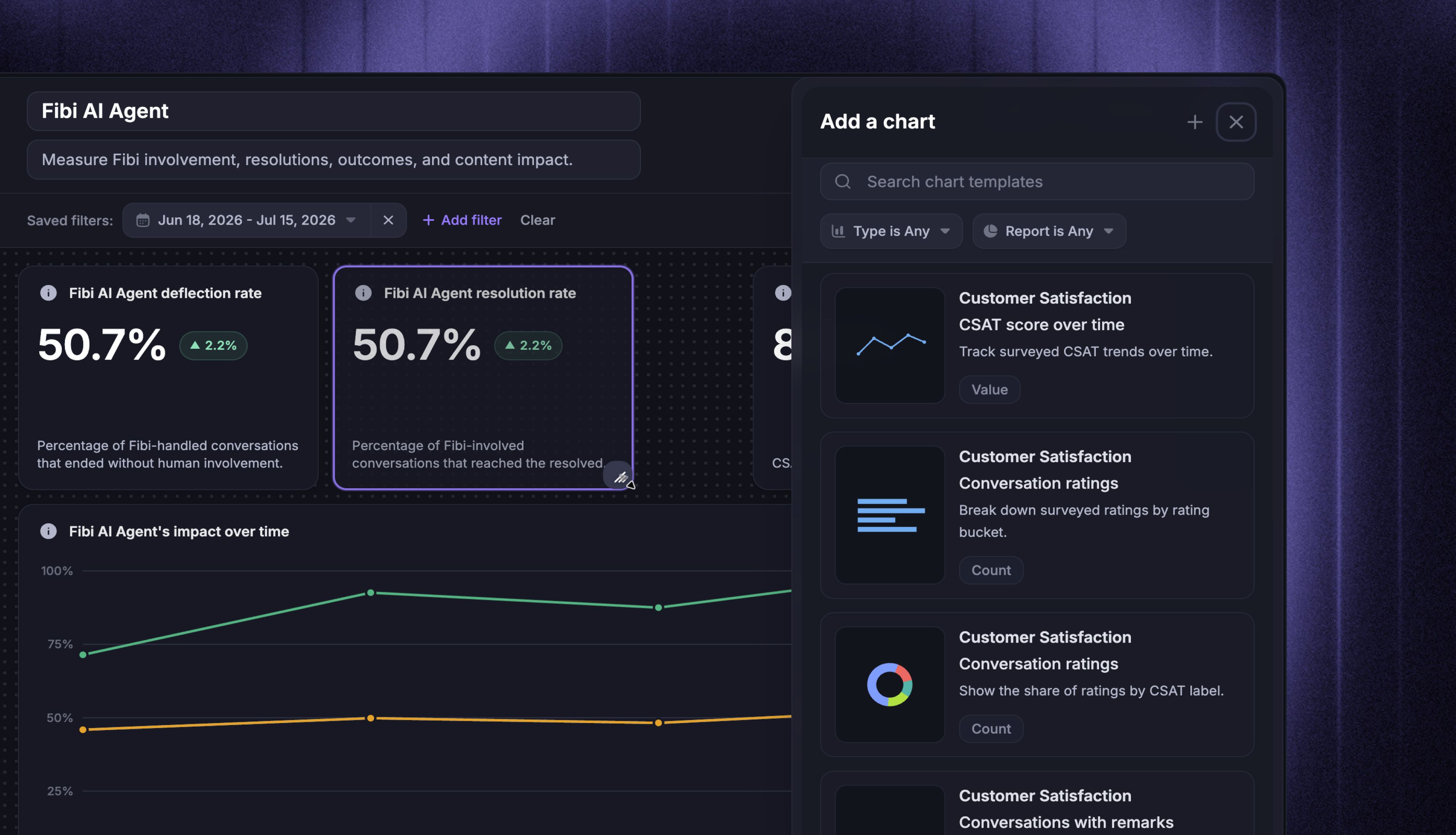
Overview
Custom reports let you build your own reporting views from the same data that powers the built-in report templates. Pick the metrics that matter to your team, filter and break them down, choose how each chart looks, and save the result to revisit and share.
Common use cases:
Put the handful of metrics your team reviews every week on one page
Compare metrics side by side, like new conversations against closed conversations
Break performance down by teammate, team, tag, or a custom attribute
Build a focused view for one channel, team, or customer segment
Note: To create a custom report, you need ‘Can access Reports’ and ‘Can create, edit and internally share Reports’ permissions. A workspace admin can manage these under Settings → Members and teams.
Build your report
Create a new report
To start creating a new custom report:
Go to Reports
Click New report
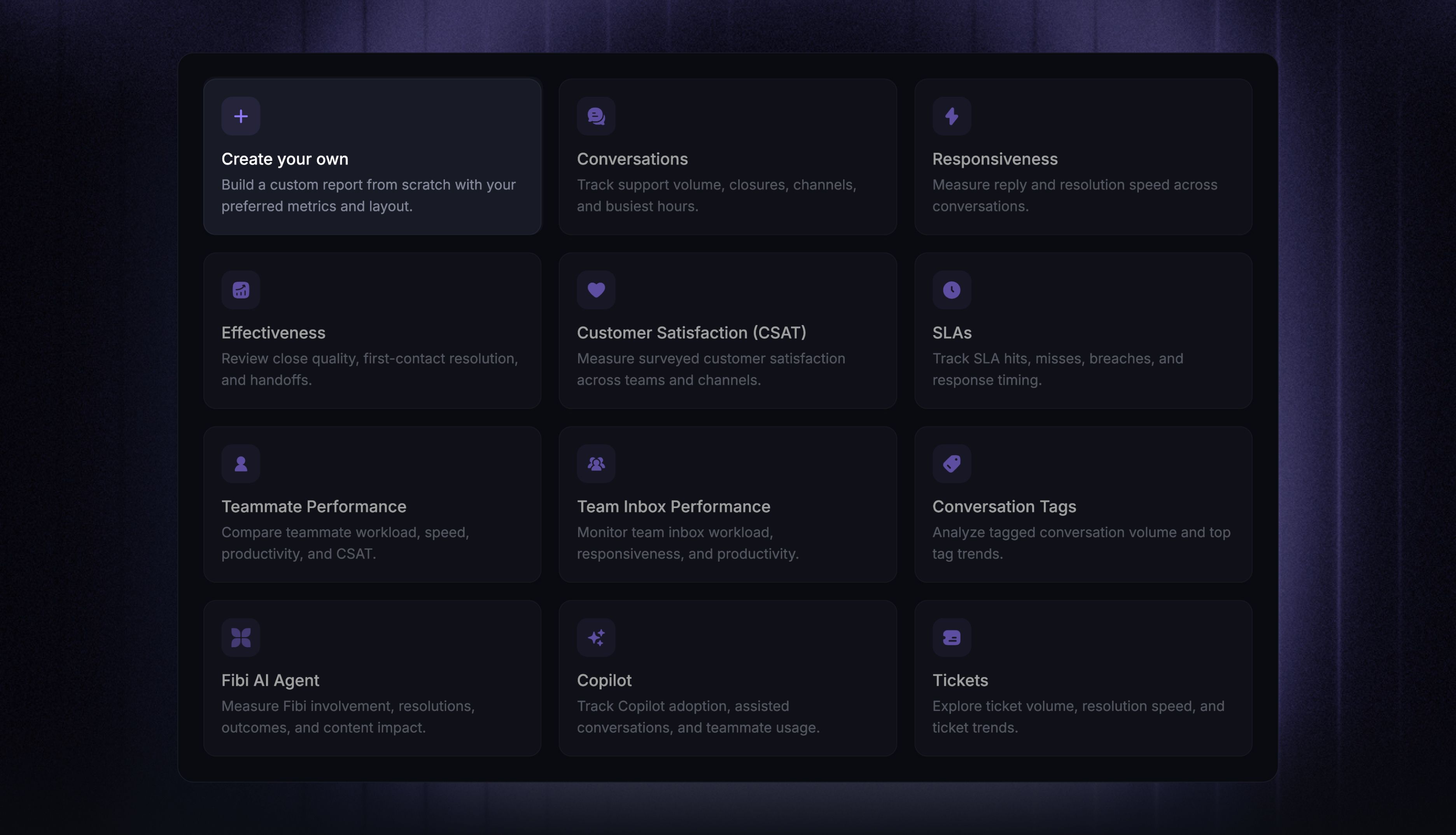
Choose Start from scratch, or select a built-in template
Selecting a template opens a preview of its charts. Click Use this template to start your report with those charts already in place - you can rename, remove, or reconfigure any of them. Your changes are saved as your own report; the built-in template itself stays unchanged.
Give the report a title and, optionally, a description so teammates understand what it shows at a glance.
Add charts
To start adding charts to your custom report:
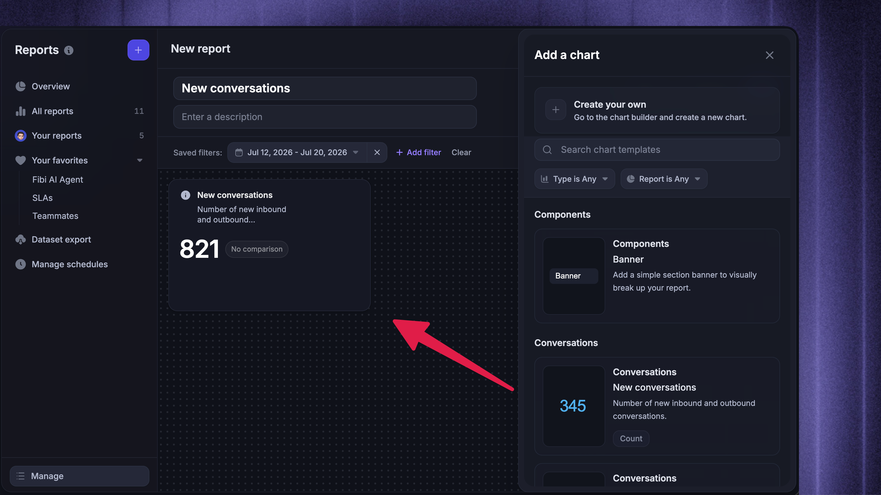
Click ‘Add chart ‘ to open the chart picking panel. You can add charts in two ways:
Chart templates: search the catalog of prebuilt charts, then click one or drag it onto the report
Create your own: opens the chart builder with a blank chart
Arrange and edit charts - On the report canvas, drag charts to rearrange or resize them, and hover a chart to edit, duplicate, or delete it.
Add banners - Choose Banner to add a text block to the canvas. Use banners to divide a report into sections or give teammates context about the charts that follow. Edit the text directly on the report and use the toolbar to format it or change its alignment and background.
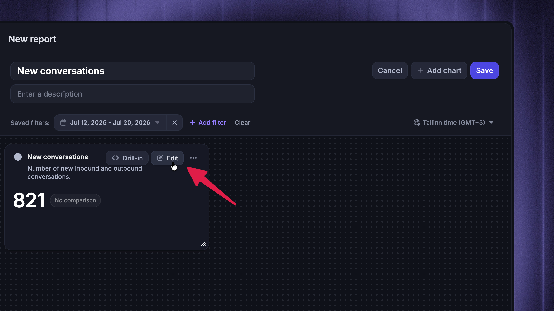
Tip: Hover a chart and click Drill-in to explore the underlying conversations and rows.
Configure the chart
To configure the chart, click the ‘Edit’ button on it:
Name the chart - Give each chart a clear title and, optionally, a description at the top of the builder. Use the description for context that is not obvious from the title, such as the question the chart answers or an important filter.
Choose a chart type - At the top of the chart builder, pick a chart type: KPI, Column, Bar, Donut, Line, Combo, Area, Heatmap, or Table. Each type supports its own set of display options.
Choose a metric
In the Metrics section, choose the metric the chart measures. Metrics are grouped by the dataset they come from, and each shows a short description of what it counts or measures. The full dictionary lives in Reporting metrics and attributes.
Under Aggregation, choose how the metric is summarized. The dropdown only shows options supported by the selected metric. Custom report chart types and options explains each aggregation.
Apply office hours - For supported time-based metrics, turn on Within office hours to exclude time outside the applicable office-hours schedule.
Compare multiple metrics - Click Add metric to compare multiple metrics. Combo charts take exactly two metrics - the first renders as columns, the second as a line, each on its own axis. Click a metric's edit icon to give it a custom legend label.
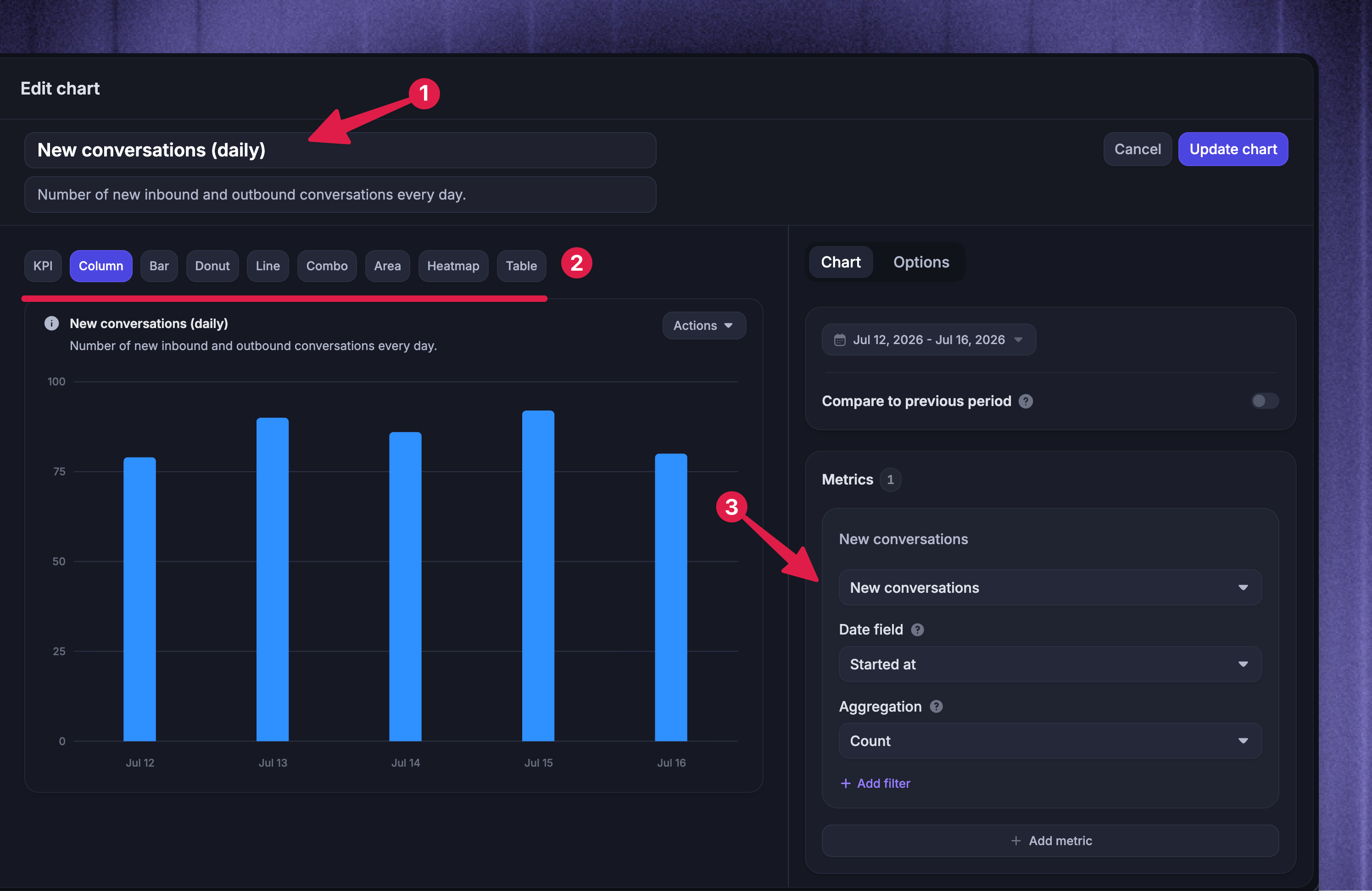
Note: Adding multiple metrics disables Segment by, Stacked, Show relative values, and targets. Column, line, and area charts support up to 20 metrics; tables support up to 10.
Break down the data
Now you can choose how to break down the data:
View by - controls how the chart is organized:
Time - group results by hour, day, week, or month across the date range
A field - group results by an attribute instead, like assignee, tag, channel, or rating
Segment by - For supported chart types, Segment by splits each View by bucket into separate series by another field (e.g. new conversations per week, segmented by channel)
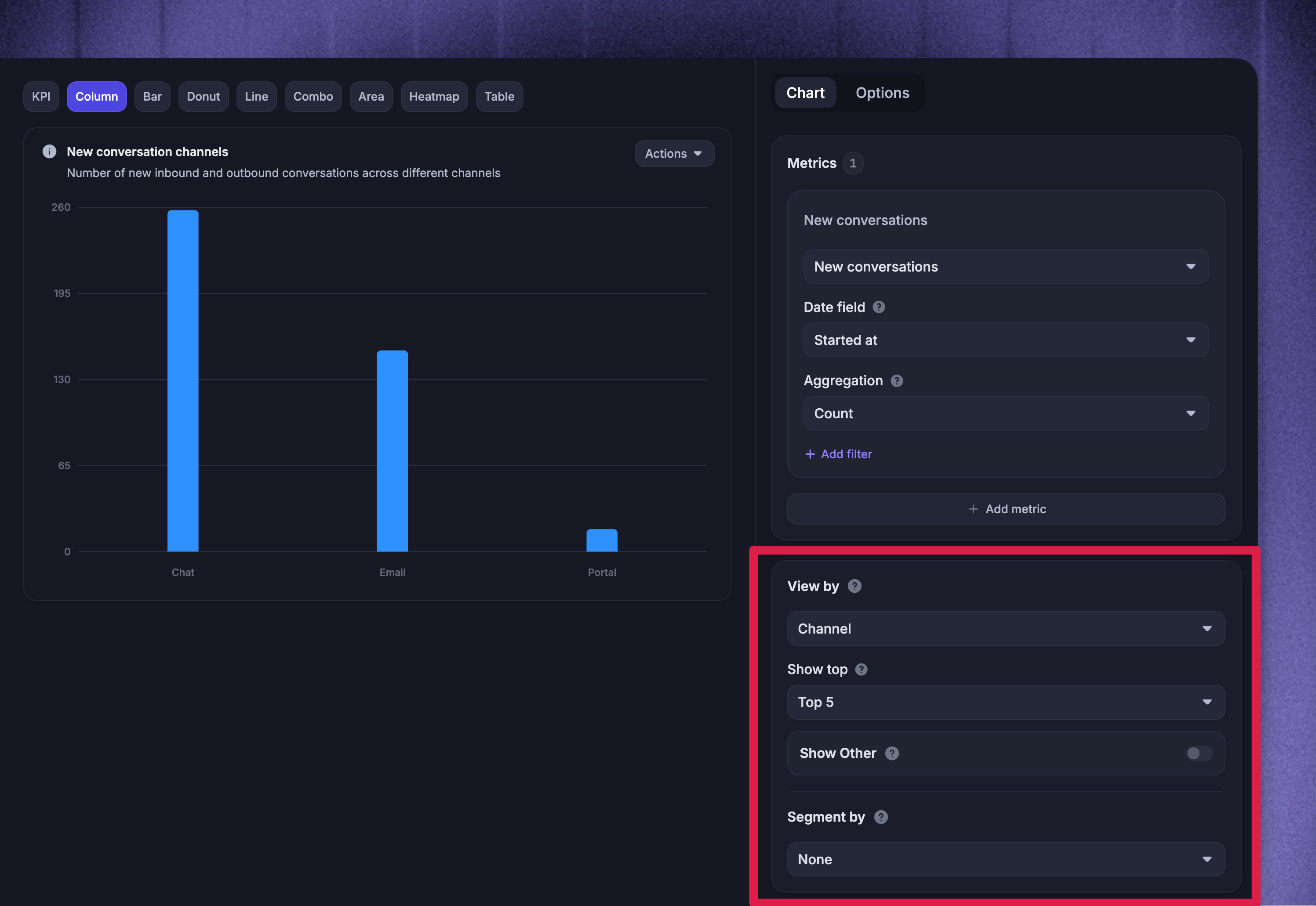
Tip: When you view by a field, use Show top to display the top 5, 7, 10, 15, or 20 groups, ranked by the chart's metric and aggregation. Donut charts automatically combine the remaining values into an Other group so every value is still represented. Other chart types do not support the Other grouping.
Filter the data
Filters work at two levels:
Chart-level filters - each metric has its own ‘Add filter’ control in the chart builder, scoping just that chart
Report-level filters - the filtering in the report header applies to every chart in the report
The report-level filter bar only offers attributes that every chart in the report supports.
You can filter by conversation, ticket, teammate, and customer attributes, including custom user and company attributes you send to Featurebase. Use teammate filters to filter by who replied, closed, or was assigned.
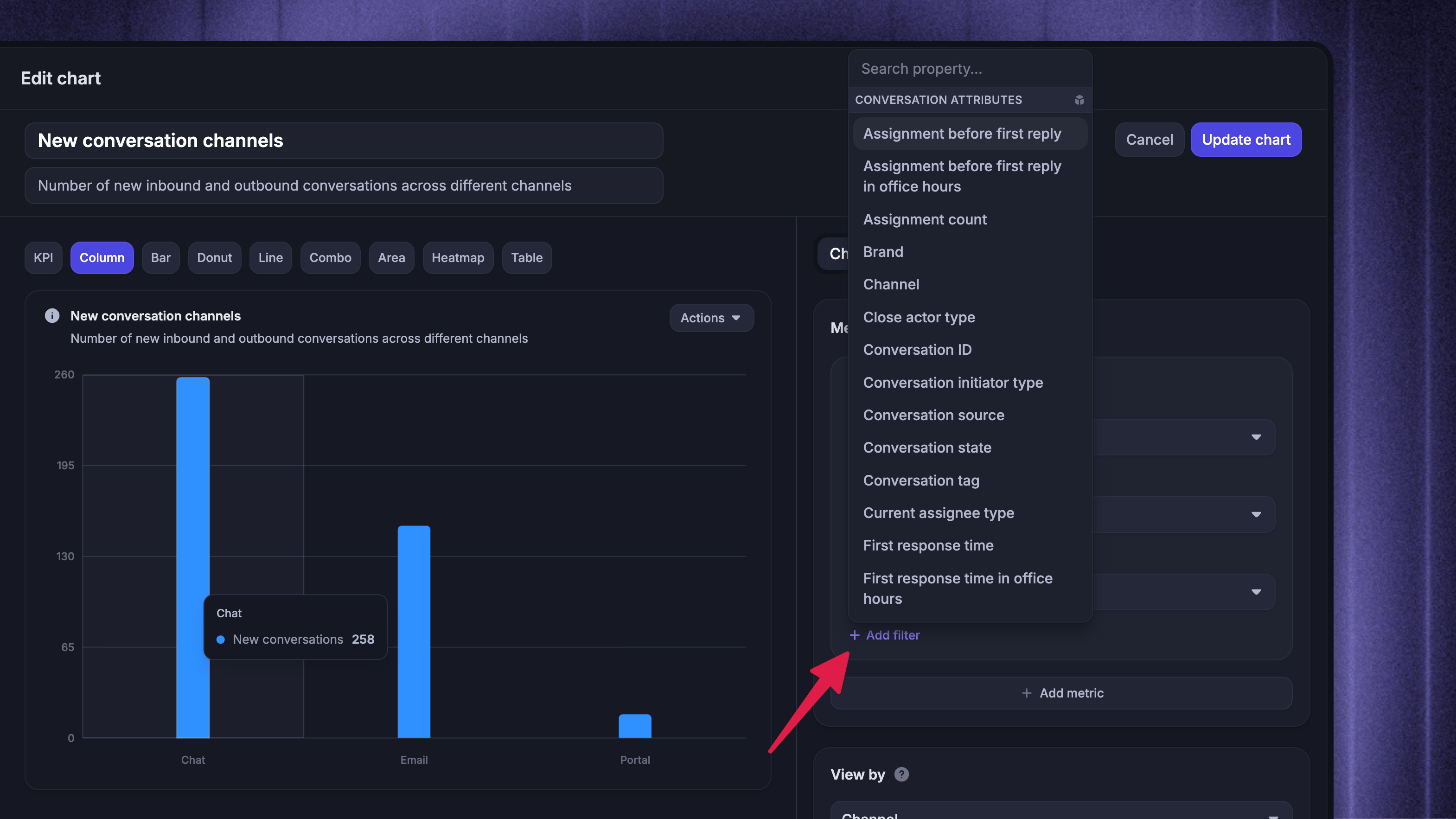
Note: Report-level and chart-level filters combine as AND conditions. A row must match both to be included.
Set the date range and timezone
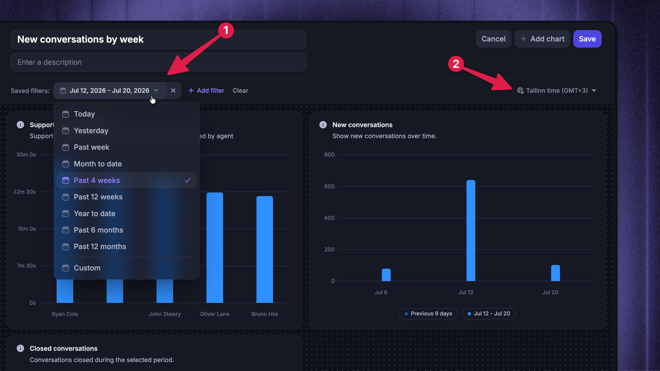
Finally, set the date range and timezone for your custom report:
Date range - The date range picker in the report header applies to the whole report. Choose a relative range that updates automatically, like Past 4 weeks or Month to date, or a fixed custom range. Individual charts can set their own date range in the chart builder, but the report's date range overrides it.
Timezone - Reports use your workspace timezone by default; use the timezone picker in the report header to view the same data in a different timezone.
Save the report
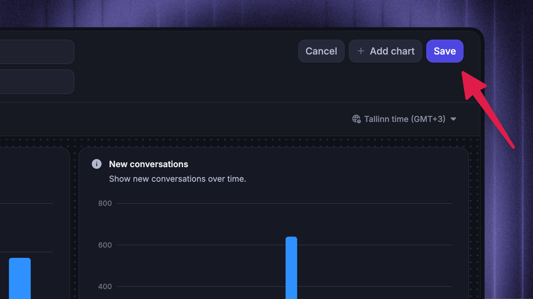
Click Save in the header. The Save report dialog confirms the report's name and description and lets you choose who can access it - new reports are private to you unless you grant access. You can change report sharing and access at any time from the Share menu on the saved report.
Manage saved reports
Edit and organize reports
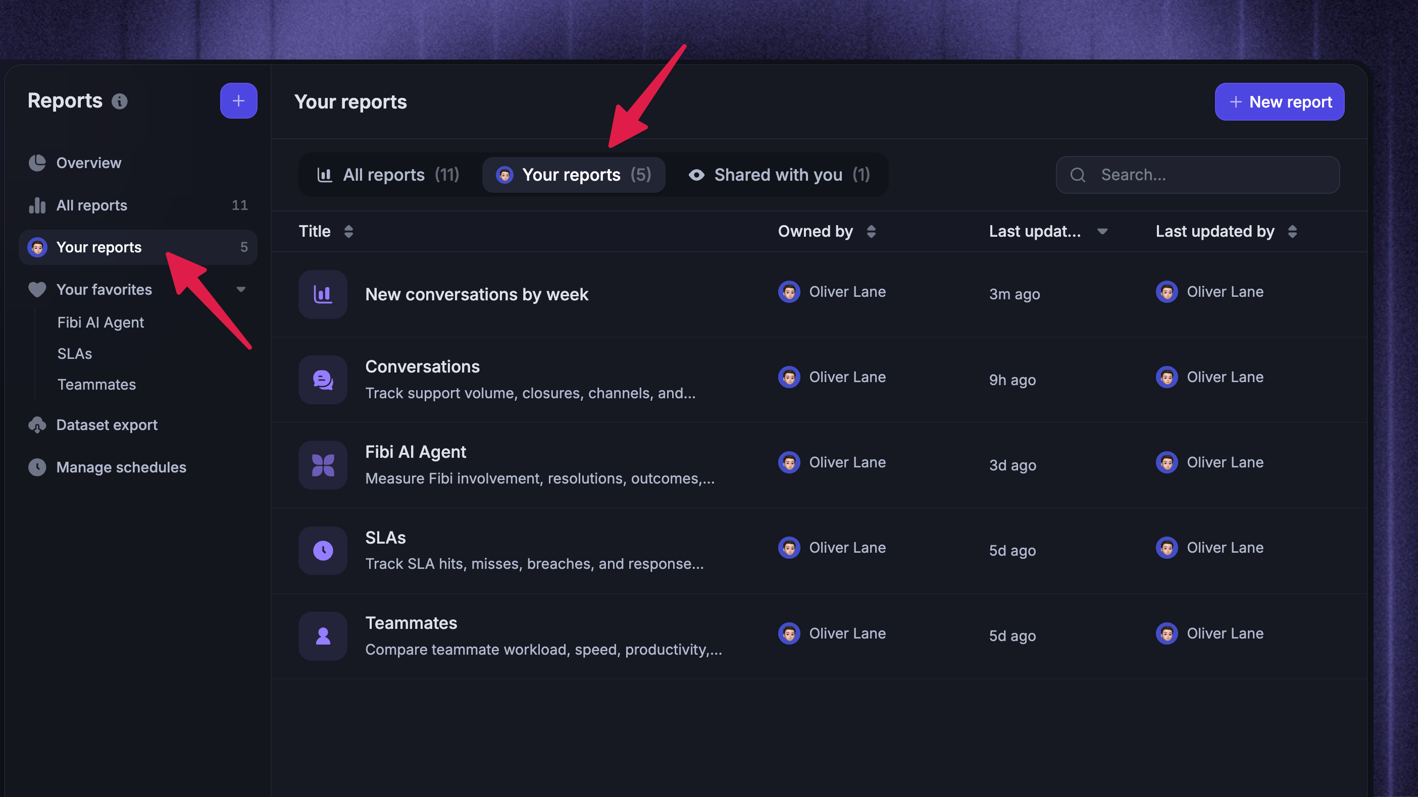
Your saved reports live under Your reports, and reports teammates have shared with you under Shared with you. Open a report to:
Edit - change the title, description, charts, and filters
Duplicate - create a copy to build on, from the More actions menu
Add to favorites - pin the report to your favorites for quick access
Delete - remove the report permanently
Explore without saving changes
When viewing a saved report, you can apply temporary date and filter changes without affecting what teammates see. Click Reset filters to return to the saved state.
If a chart shows unexpected numbers, see Troubleshooting custom reports.
Note: To make date or filter changes visible to everyone with access, edit and save the report.
FAQs
Can I edit a built-in template report?
Can I edit a built-in template report?
No. The ‘Overview’ report has its own read-only page and cannot be copied. For the other built-in templates, click Use this template to create your own editable report while leaving the template unchanged.
What time range can a report cover?
What time range can a report cover?
Reporting data starts on July 12, 2026. Custom ranges cannot begin earlier, and relative ranges that reach further back show data only from that date onward. The Reports FAQs explain the boundary in more detail.
How do report-level and chart-level filters interact?
How do report-level and chart-level filters interact?
They combine as AND conditions, so a row must match both levels to be counted.
Who can see the reports I create?
Who can see the reports I create?
Only you, until you share them. New reports are private by default; use Share → Manage access to grant access to specific teammates or roles.
Was this helpful?
Still need help? Ask the team